Quick check
Are your website enquiries reaching the right place?
If your website looks fine but leads are quiet, the issue may be hidden in your forms, email delivery, contact flow, messaging, or visibility.
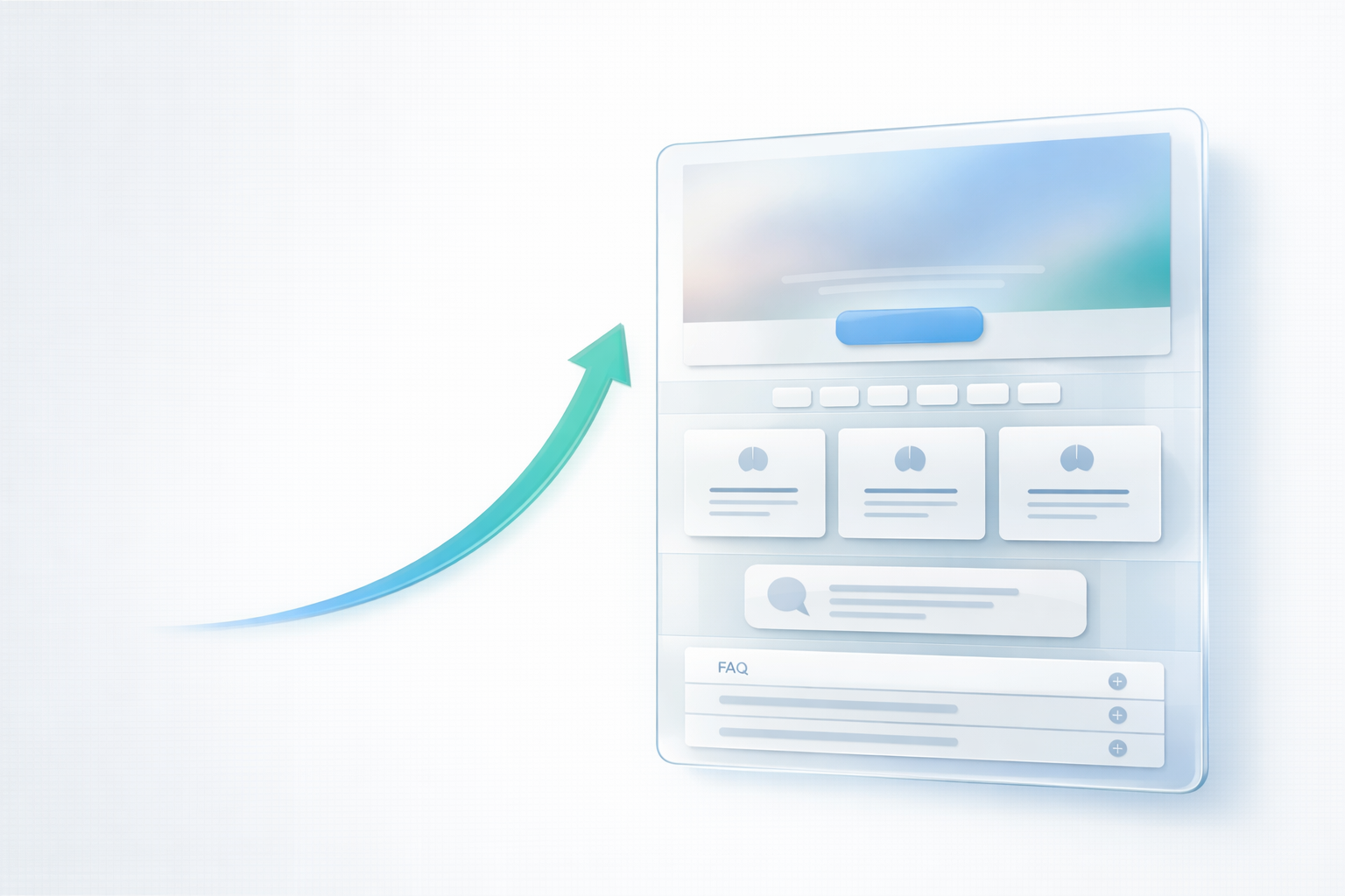
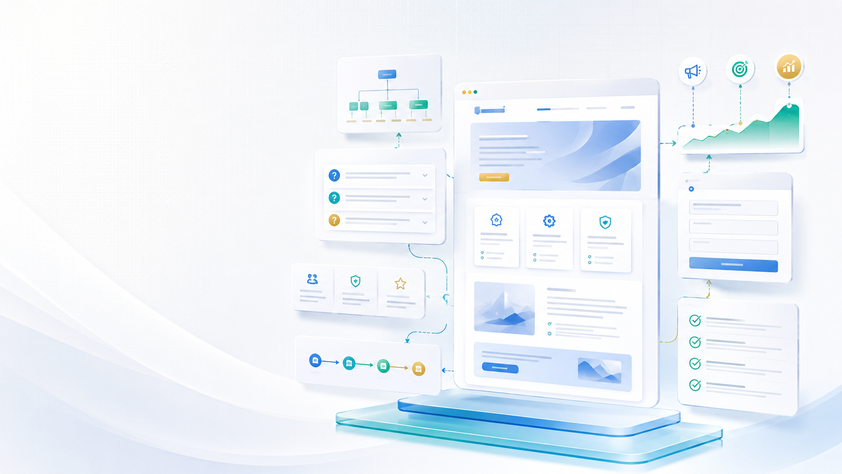
Homepage Checklist: The 7 Elements That Turn Visitors Into Enquiries
If your homepage gets traffic but not enough enquiries, the problem is rarely “SEO” alone.
Most of the time, the visitor lands on the page and simply doesn’t feel confident enough to take the next step. They’re not sure what you do, who it’s for, what happens next, or why you’re the right choice. So they leave.
A high-converting homepage isn’t about fancy animations. It’s about clarity, trust, and a smooth next step.
This post covers the seven homepage elements that consistently increase enquiries for UK businesses.
If you want Empex to review and improve your homepage, start here:
Web Design & Development
1) A clear “what you do” message (in the first few seconds)
Your homepage should answer a simple question immediately: “What is this business, and how does it help me?”
This is not the place for vague slogans. Your headline should say what you do, and your supporting line should explain the outcome.
A simple test: if someone reads only your headline and the next line, would they be able to describe your business accurately?
When this is clear, everything else on the page becomes easier. When it’s unclear, the visitor is already slipping away.
2) One primary CTA that stays consistent
Many homepages have too many competing buttons: “Learn more”, “View services”, “Get a quote”, “Contact”, “Book”, “Call”.
The result is hesitation.
A better approach is to pick one primary action and repeat it consistently. That primary action depends on your business, but it should be the most valuable next step.
For service businesses, it’s often booking or requesting a quote.
For professional services, it’s often booking a call.
For most Empex clients, the clearest path is a short audit call:
Book an audit call
3) Trust signals that appear early (not hidden)
Trust is not something you earn at the end of the page. It’s something you build from the start.
That can be as simple as showing a short line about experience or outcomes, a small set of testimonials, proof that you are a real business, and a clear process.
People decide emotionally first and then justify logically. Trust signals support that decision.
4) A “who this is for” section (so the right people stay)
Many businesses try to speak to everyone, which usually means they speak clearly to no one.
A short section that explains who you work with helps the visitor feel understood. It also reduces low-quality enquiries because it sets expectations.
You don’t need to exclude people aggressively. You just need to be specific enough that the right customer recognises themselves.
5) A simple services overview (focused, not overwhelming)
Visitors don’t want to read a full service catalogue on your homepage. They want to understand what options exist.
A good services section is short and clear. It helps the visitor say: “Yes, they do what I need.”
Then the next step should be obvious: book, enquire, or view the relevant service page.
If you also publish helpful articles, this section becomes even more powerful because your blog reinforces trust and expertise.
6) A frictionless enquiry path (forms that feel easy)
Forms are where conversion is won or lost.
A long form feels like effort. A confusing form feels risky. A simple form feels safe.
For many businesses, the best approach is fewer fields, clear labels, a short message box, confirmation that the message was received, and a clear expectation of when you’ll reply.
You can collect deeper details later. The homepage goal is to start the conversation.
7) A “what happens next” section (so people feel safe to act)
This is one of the most overlooked sections on homepages.
People hesitate because they don’t know what happens after they click “Book” or “Request a quote”.
A short “what happens next” section reduces anxiety. It can be as simple as:
Step 1: send an enquiry or book a call
Step 2: we confirm and ask a few details
Step 3: you receive a clear plan or quote
When the next step feels predictable, conversion rises.
A simple way to improve your homepage quickly
If you want a practical approach, start with the first screen:
- Make the offer clear
- Choose one primary CTA
- Add one trust element nearby
That alone often increases enquiries. Then you improve the rest of the page step by step.
Want Empex to improve your homepage conversion?
If your homepage is not converting visitors into enquiries, you don’t need guesses. You need a clear plan and clean implementation.
✅ Book a website improvement consultation: Book now
Or ask a question: Contact us
Keep reading
Related insights
More practical guidance to help improve visibility, conversion, enquiries, and digital systems.
EMPEX Digital Is Simplifying Its Services for Better Project Delivery
EMPEX Digital has updated its service structure. SEO and digital strategy are now delivered as one connected service, hosting and maintenance have moved into optional aftercare plans, and pay-monthly websites are no longer available.
Why Clear Service Pages Matter Before You Spend More on Marketing
Many small businesses spend time and money on marketing before their website clearly explains what they offer. This guide explains why clear service pages matter, how they support trust and SEO, and why improving them can make campaigns more effective.
Is Your Website Ready Before You Start a Marketing Campaign?
Many businesses start promoting their services before checking whether their website is ready to convert visitors. This guide explains what to review before launching a marketing campaign, including messaging, landing pages, mobile experience, trust signals, forms, tracking, and enquiry flow.
Discussion
Comments
No comments yet
Be the first to share a useful thought, question, or takeaway from this article.